Many organisations are using SharePoint Online.
SharePoint will very often become the intranet in such organisations.
This then raises the common compliant that the corporate brand / identity is not implemented in SharePoint.
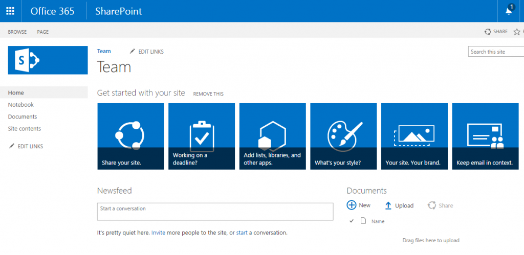
In fact many user’s we find are confronted with the raw, out of the box, look.
SharePoint “Branding” as a project, however, tends to raise a few eyebrows since it has a slightly unfair reputation for high cost and complexity.
Let us look at a simple way to change the look of SharePoint online. This approach also works for SharePoint 2013 and 2016.
Firstly we will take a design cue.
Let us assume that this image is representative of our organisations’ brand / identity.
Now we will download and install the design tool.
https://www.microsoft.com/en-us/download/details.aspx?id=38182
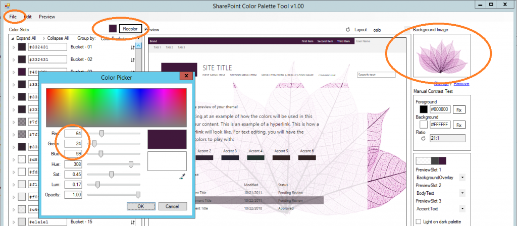
In the design tool we will.
- Change the background image.
- Change the colour (Next to “recolor”) to the corporate deep purple.
- Click “Recolor” to change SharePoint to tune into our new identity (We are cheating here to avoid having craft each individual colour used which is what those color slots control).
- File > Save > MyLook.SpColor
Now we will go the theme gallery of SharePoint and upload the spcolor file.
You will find this located at;
/sites/sitename/_catalogs/theme/15
or
/_catalogs/theme/15
Now we can go to the site assets library and upload our leaf.
/sites/sitename/SiteAssets/Forms/AllItems.aspx
or
/SiteAssets/Forms/AllItems.aspx
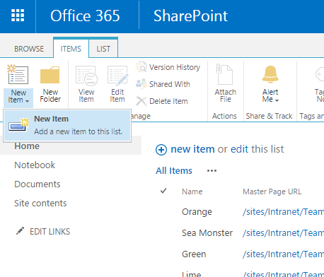
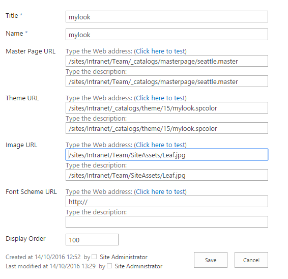
Now we will manually assemble a composed look.
You will find the list under Site Settings > Web Designer Galleries > Composed looks.
Now in the composed look we will ensure that;
- The Master Page URL points to the existing seattle.master or olso.master
- The Theme URL is set to your new spcolor file.
- The Image URL is set to your background image.
Save this new composed look.
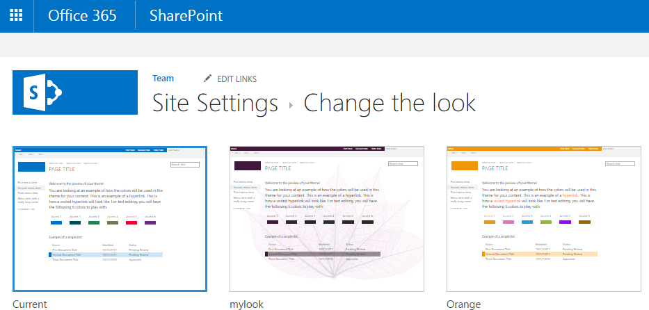
Now when change the look of the site we can select the new composed look.
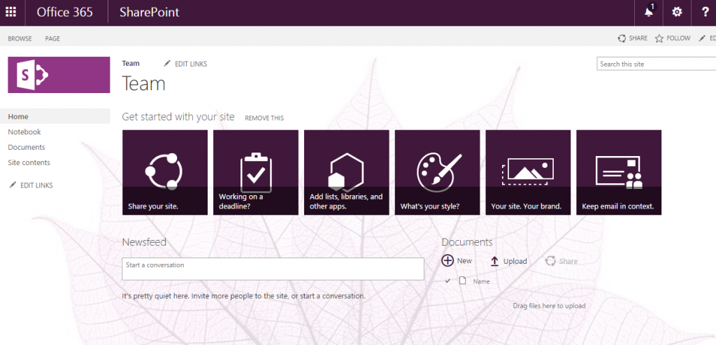
Once applied to the site it will be rendered with something like the corporate brand / identity you were looking for.
Ok great.
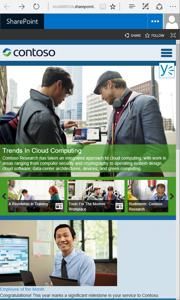
But what is that I hear you say? Full branded intranet, something like the below is what you had in mind?
Well this all starts with that same “Composed Look”. Why these sort of “intranets” look more “branded” is because the content and layout of the pages has been made more engaging through the use of web parts, page layouts and the such.
We normally work with our customers creative team to ensure that they best understand how to do this.
 |
|
 |
|
 |
|
 |
|
 |
|
 |
Middle East | Global |

